You can customise your docs using Custom CSS and Custom Javascript. Below are some of the most used customisations:
Hide version selector/picker
.customise.live .version-picker {
display: none;
}
Hide section/documentation selector/picker
.customise.live .section-picker-container {
display: none;
}
Make top navigation sticky
Only in Original UI
Only apply this customisation for the original UI. For Next UI, there's a setting under Project Settings > Customisation to enable it.
@media (min-width: 1024px) {
.customise.live .topnav-container {
position: fixed;
top: 0;
height: auto;
z-index: 10;
}
.customise.live .mega-container {
margin-top: 70px;
}
.customise.live .stick-top {
top: 70px !important;
}
}
When navigation is sticky, the scrolling behaviour must be modified in order for headings not to hide under the navigation when it is scrolled to. Add the following to Custom HEAD tags to modify scrolling offsets:
<script>
window.settings.apply({
scrolling: { // Modify values as needed, according to your navbar height.
scrollTopOffsetOnFragmentChange: {documentation: -90, apiReference: -50}
}
});
</script>
Decrease top navigation links font-size
Use if the titles are too long and they're breaking into two lines.
.customise.live .topnav-container .links {
font-size: 13px; /* Original is 14px */
}
.customise.live .topnav-container .links .link {
font-size: inherit;
}
Move index and table of contents to edges of screen
Deprecated
This is enabled by default now.
.customise.live .container.doc-container {
max-width: 100%;
}
.customise.live .container.doc-container > .row {
justify-content: space-between;
}
.customise.live .documentation {
padding-left: 0;
}
Set theme automatically according to user preferences
Place in Custom HEAD tags. Only use one of the if conditions.
<script>
// If your theme is set to dark by default, use the following IF condition.
if (window.matchMedia && window.matchMedia('(prefers-color-scheme: light)').matches) {
window.setTheme('light');
}
// If your theme is set to light by default, use the following IF condition.
if (window.matchMedia && window.matchMedia('(prefers-color-scheme: dark)').matches) {
window.setTheme('dark');
}
</script>
Place in Custom HEAD tags.
<style>
.search-contact-us {
color: inherit;
font-size: inherit;
text-decoration: underline;
}
.search-contact-us:hover {
color: inherit;
}
</style>
<script>
document.addEventListener('onsearch', function (event) {
let searchEl = document.querySelector('.topnav .search');
setTimeout(() => {
if (!document.querySelector('.search-results-container .result')) {
document.querySelector('.search-results-container .count').innerHTML =
'No search results found. <a class="search-contact-us" href="/support-center/contact-us">Contact us?</a>';
}
});
});
</script>
Hide version warning banner for a specific version
Place in Custom HEAD tags.
<script>
document.addEventListener('onsectionchange', e => {
let versionWarningEl = document.querySelector('.version-warning');
if (!versionWarningEl) {
return;
}
if (window.getActiveVersion().slug === 'v4') {
console.log('Hiding banner');
versionWarningEl.classList.add('d-none');
} else {
versionWarningEl.classList.remove('d-none');
}
});
</script>
Collapse Section Picker into Dropdown on Next UI
Place in Custom CSS.
.customise.live .section-links-group {
display: none !important;
}
.customise.live app-section-picker.d-mobile {
display: inline-block !important;
}
@media (min-width: 768px) {
.customise.live .version-selector-group {
padding: 8px 0;
}
}
Blur Top Navigation Bar
Place is Custom CSS. You might need to handle light theme separately.
.customise.live .topnav-container {
background-color: transparent;
backdrop-filter: blur(10px);
-webkit-backdrop-filter: blur(10px);
-moz-backdrop-filter: blur(10px);
border-bottom: 1px solid #44444433;
}
.customise.live .external-search.dark {
background: #00000033;
}
Adding Icons to Index
To add an icon in place of the expander icon for categories and parent pages in the index, add such CSS:
/* First hide the expander icons. You could do this individually or for all expanders */
.customise .sidebar .node_XXXXX>.node-wrapper>.node-content-wrapper>.expander-icon>i {
display: none;
}
/* To add an emoji */
.customise .sidebar .node_XXXXX>.node-wrapper>.node-content-wrapper>.expander-icon:before {
content: '👋';
}
/* To add an icon */
.customise .sidebar .node_XXXXX>.node-wrapper>.node-content-wrapper>.expander-icon:before {
content: "";
background: url("YYYYY");
background-size: 16px 16px;
width: 16px;
height: 16px;
}
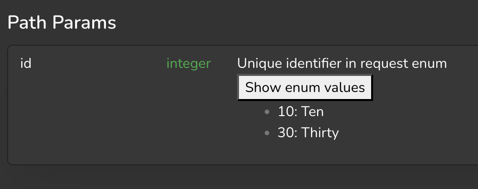
Expanding Enum in API Reference
To have enums with their varnames expand on click, add the following in Custom HEAD tags:
<script>
document.addEventListener('onreferencecontentloaded', function (e) {
console.log('Reference content loaded');
// Find all elements with the "property" class
e.detail.el.querySelectorAll('.property').forEach(element => {
// Check if the text starts with "Enum: "
if (element.textContent.trim().startsWith("Enum: ")) {
// Extract the enums from the content
const match = element.innerHTML.match(/<code>(\d+)\s\((.*?)\)<\/code>/g);
if (match) {
const enumValues = match.map(item => {
const [, key, value] = item.match(/<code>(\d+)\s\((.*?)\)<\/code>/);
return { key, value };
});
// Create a new button element to replace the original one
const button = document.createElement('button');
button.classList.add('expand-enum-vars');
button.textContent = 'Show enum values';
const ul = document.createElement('ul');
ul.style.display = 'none';
// Add the list items based on the enum values
enumValues.forEach(({ key, value }) => {
const li = document.createElement('li');
li.textContent = `${key}: ${value}`;
ul.appendChild(li);
});
// Toggle display on button click
button.addEventListener('click', () => {
ul.style.display = ul.style.display === 'none' ? 'block' : 'none';
});
// Replace the original span with the button and list
element.replaceWith(button, ul);
}
}
});
});
</script>
You may modify the CSS as needed for the button using the CSS selector .customise.live .references .expand-enum-vars.
Add Dropdown to Navigation Links
To create a dropdown which you can add to navigation links in the top navigation bar, use this javascript:
<script>
/**
* Creates a dropdown menu
* @param {Object} options - Configuration options
* @param {string} options.buttonText - Text for the dropdown button
* @param {string} options.href - URL for the menu item
* @param {Function} options.onClick - Optional click handler
* @param {Array} options.items - Array of menu items
* @param {string} options.items[].text - Display text for the menu item
* @param {string} options.items[].href - URL for the menu item
* @param {Function} options.items[].onClick - Optional click handler
* @param {string} options.buttonClass - Optional CSS class for the button
* @param {string} options.menuClass - Optional CSS class for the menu
* @return {HTMLElement} The created dropdown element
*/
function createDropdown(options) {
// Create container
const dropdownContainer = document.createElement('div');
dropdownContainer.className = 'custom-dropdown';
if (!options.items) {
// make a link instead of button
const link = document.createElement('a');
link.innerHTML = options.buttonText;
link.className = options.buttonClass || 'custom-dropdown-button';
link.href = options.href;
if (options.onClick) {
link.onclick = options.onClick;
}
return link;
}
// Create button
const button = document.createElement('button');
button.className = options.buttonClass || 'custom-dropdown-button';
button.innerHTML = options.buttonText + '<i class="fas fa-chevron-down"></i>';
button.addEventListener('click', function (e) {
e.stopPropagation();
menu.classList.toggle('show');
button.classList.toggle('active');
// Close dropdown when clicking outside
document.addEventListener('click', function () {
menu.classList.remove('show');
button.classList.remove('active');
document.removeEventListener('click', arguments.callee);
});
});
// Create menu
const menu = document.createElement('div');
menu.className = options.menuClass || 'custom-dropdown-menu';
// Create menu items
options.items.forEach(item => {
const menuItem = document.createElement('a');
menuItem.textContent = item.text;
menuItem.href = item.href || '#';
menuItem.className = 'custom-dropdown-item';
if (item.onClick) {
menuItem.addEventListener('click', function (e) {
// Only prevent default if explicitly returning false
const result = item.onClick(e);
if (result === false) {
e.preventDefault();
}
});
}
menu.appendChild(menuItem);
});
// Assemble dropdown
dropdownContainer.appendChild(button);
dropdownContainer.appendChild(menu);
return dropdownContainer;
}
</script>
Use the code above as such:
<script>
const navbar = document.querySelector('.nav-btn-group.links-group');
navbar.appendChild(createDropdown({
buttonText: 'Get Started',
items: [
{
text: 'Installation',
href: projectUrl + 'installation',
onclick: function () {
navigate('installation', {addBasePath: true});
}
},
{
text: 'Configuration',
href: projectUrl + 'configuration',
onclick: function () {
navigate('configuration', {addBasePath: true});
}
},
{
text: 'Operating',
href: projectUrl + 'operating',
onclick: function () {
navigate('operating', {addBasePath: true});
}
}
],
}));
</script>
Add a Fading Edge to References
To add a fading edge to references, use the following javascript:
document.addEventListener("onsectionchange", (event) => {
if (event.detail.type === 'reference') {
setupFadingEdge();
}
});
document.addEventListener('onreferencecontentloaded', (event) => {
const fadingEdge = document.querySelector('.references .sidebar .sticky-top');
if (!fadingEdge) {
return;
}
const scrollElement = fadingEdge.querySelector('.ps-container');
applyFadingEdge(scrollElement, fadingEdge);
});
function setupFadingEdge() {
const fadingEdge = document.querySelector('.references .sidebar .sticky-top');
if (!fadingEdge) {
console.warn('Fading edge element not found');
return;
}
const scrollElement = fadingEdge.querySelector('.ps-container');
applyFadingEdge(scrollElement, fadingEdge);
scrollElement.addEventListener('scroll', () => applyFadingEdge(scrollElement, fadingEdge));
}
function applyFadingEdge(scrollEl, el) {
const scrollTop = scrollEl.scrollTop;
const scrollHeight = scrollEl.scrollHeight;
const clientHeight = scrollEl.clientHeight;
const isScrolled = scrollTop + clientHeight < scrollHeight;
if (isScrolled) {
// Calculate how close we are to the bottom (as a percentage)
const scrollPosition = scrollTop + clientHeight;
const scrollRatio = Math.min(1, (scrollHeight - scrollPosition) / (scrollHeight * 0.25));
// Adjust the gradient based on scroll position
// As scrollRatio approaches 0, the gradient becomes less pronounced
const opacity = Math.max(0, scrollRatio * 100);
el.style.maskImage = `linear-gradient(180deg, #FFF 75%, rgba(255, 255, 255, ${1 - opacity/100}) 99%)`;
} else {
el.style.maskImage = '';
}
}
Redirect to Documentation in Latest Version
If you wish for a documentation to only be view-able in the latest version, add the following Custom HEAD tags:
<script>
document.addEventListener("onsectionchange", event => {
const version = window.getActiveVersion();
const section = window.getActiveSection();
if (section.type === 'documentation' && section.slug !== 'example-slug' && !version.isLatest) {
const page = window.getActivePage();
navigate('/' + section.slug + '/' + page.slug, {addBasePath: true});
}
});
</script>
Indent Index under Category
To add indentation under category, add the following to Custom CSS:
.customise.live .category-container .tree-node-level-2 {
margin-left: 8px;
}
Move Search Bar to Landing Page Hero
To move the search bar to a hero element with selector .docs-hero-content in the landing page, add the following to Custom HEAD tags:
<script>
let searchEl = null;
let originalSearchParent = null;
document.addEventListener("onsectionchange", (event) => {
setupSearch(event.detail.type === 'landing-page');
});
function setupSearch(placeInHero) {
if (!searchEl) {
searchEl = document.querySelector('app-search');
originalSearchParent = searchEl.parentElement;
}
if (placeInHero) {
document.querySelector('.docs-hero-content').append(searchEl);
} else if (originalSearchParent) {
originalSearchParent.append(searchEl);
}
}
</script>
If you're using Next UI, use app-search-v2 instead of app-search.
 Made in DeveloperHub