 Made in DeveloperHub
Most landing pages are best built with the visual Landing Page Designer. If you want complete control and branding, you can instead craft a landing page from your own HTML, CSS, and JavaScript. This works for both the main landing page and any custom page.
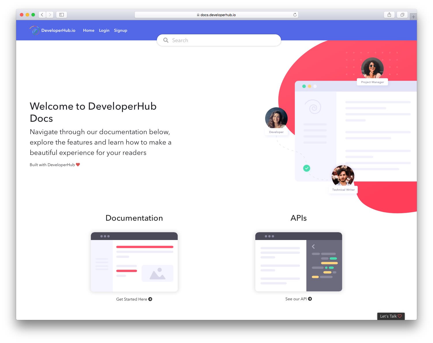
Our Custom Landing Page
Use Custom Landing Page
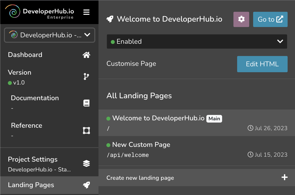
To switch a landing page to custom HTML:
- In the editor top navigation, open the scope picker and select Landing Pages.
- Open Manage Landing Pages and select the page (the main landing page or a custom page).
- Under Customise, turn on Use custom HTML page.
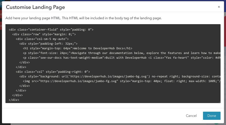
To modify the landing page HTML:
- Click Edit HTML.
- Paste or type in the HTML that will make your custom landing page. Click Save. This will save the HTML in draft mode, so you can test it out.
- To publish it to readers, click Save & Publish.
- To revert the draft changes, click Revert.
The HTML you provide will be inserted into the body of the landing page in a div with landing-page-container class. Thus, do not wrap everything in <html> tag. <head> tag will also be discarded. See our examples below.
This also apply to <style>. All styles should be moved to Custom CSS.
Crafting a Landing Page
When customising the landing page, you may enter HTML that will be inserted asynchronously in your landing page.
Note that we do not evaluate or validate the HTML inserted - please double check that it is valid.
Adding CSS
If you wish to add CSS, then you can add it to Custom CSS, or you could add it in Custom HEAD Tags in a <style> tag, or even link external CSS by using <link> tag.
Remember that the CSS is applied globally. Modifying classes of conventional names (specially Bootstrap selectors), such as .container might have unwanted effects.
Adding Javascript
If you wish to add Javascript, then you can add it in Custom HEAD Tags in a <script> tag. If you wish to reuse the auto-generated cards that DeveloperHub builds from your content, then you can listen to a dedicated event oncardschanged as such:
xxxxxxxxxx<script>document.addEventListener('oncardschanged', function (event) { console.log("cards changed", event);});</script>This event also indicates that the landing page HTML has already loaded, and that you can query its selectors.
The detail carries docs and refs (and groups when your project uses navigation groups), mirroring the card generation strategy. The event output looks like the follows for the main landing page:
xxxxxxxxxxCustomEvent { "detail": { "sectionType": "landing-page" "docs": [ { "title": "Start Here", "link": "/support-center", "details": [ {"title": "Getting Started", "link": "/support-center/getting-started"}, {"title": "Writing Documentation", "link": "/support-center/writing-documentation"}, {"title": "Structuring Documentation", "link": "/support-center/structuring-documentation"} ] }, { "title": "Blocks", "link": "/support-center", "details": [ {"title": "Code Blocks", "link": "/support-center/code-blocks"}, {"title": "Callouts", "link": "/support-center/callouts"}, {"title": "Images", "link": "/support-center/images"} ] }, ], "refs": [ { "title": "API", "link": "/api" } ] }}For a non-main landing page, the detail would be as such:
xxxxxxxxxxCustomEvent { "detail": { "sectionType": "custom-page", "sectionId": 612 "docs": [ { "title": "Start Here", "link": "/support-center", "details": [ {"title": "Getting Started", "link": "/support-center/getting-started"}, {"title": "Writing Documentation", "link": "/support-center/writing-documentation"}, {"title": "Structuring Documentation", "link": "/support-center/structuring-documentation"} ] }, { "title": "Blocks", "link": "/support-center", "details": [ {"title": "Code Blocks", "link": "/support-center/code-blocks"}, {"title": "Callouts", "link": "/support-center/callouts"}, {"title": "Images", "link": "/support-center/images"} ] }, ], "refs": [ { "title": "API", "link": "/api" } ] }}Where sectionId is an identifier you may use to customise what elements are added to which landing page.
Linking to Content
To navigate to content in the documentation from your landing page, use absolute paths. When using absolute paths, the navigation would be done internally in the single-page application, rather than a full-slow navigation. For example:
xxxxxxxxxx<a href="/support-center/getting-started"> Getting Started</a><!-- If your project has a basepath (e.g. docs), include it --><a href="/docs/support-center/example-requests"> Example Requests</a> <!-- ❌ do not use for internal navigation --><a href="https://docs.example.com/support-center/getting-started"> Example Requests</a>If you are creating the content dynamically using Javascript, you can use window.applyClickHandlersOnLinks() at the end of your javascript (when all anchors have been added) to make all absolute path links navigate internally:
Previously, openLink function used to handle opening internal links. This is no longer required and such functions can be removed.
Tips & Tricks
Hiding Top Navigation Bar
If you wish to hide the top navigation bar when on the custom landing page, you can do that using Javascript:
Mocking default Landing Page
See Mocking Default Landing Page for step-by-step instructions on how to create a landing page like our own.