 Made in DeveloperHub
Help your readers find what they need the moment they arrive. Landing pages are built with a visual, block-based designer right inside DeveloperHub, so you can compose a polished entry point without writing any code.
There are two kinds of landing page:
- Main landing page: the page that lives at the root
/of your docs site. - Custom pages: extra pages at any path you choose (for example
/pricingor/start). One custom page can also act as your 404 page.
Both are designed in exactly the same way.
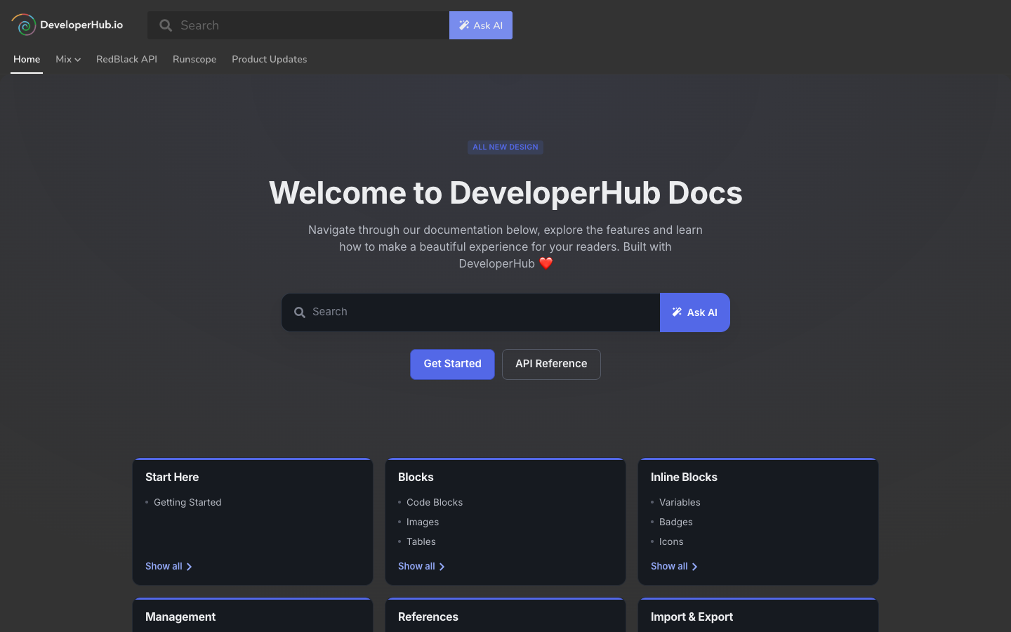
A landing page as readers see it
The Landing Page Designer
The designer shows a live preview of your page as readers will see it, with a settings panel (the inspector) on the right. You edit directly on the page.
To open the designer, do any of the following:
- In the editor top navigation, open the scope picker and choose Landing Pages. This opens the main landing page in the designer.
- From Manage Landing Pages, select a page and click Edit design.
- Use the Landing Pages picker in the editor top navigation to switch between the main landing page and your custom pages.
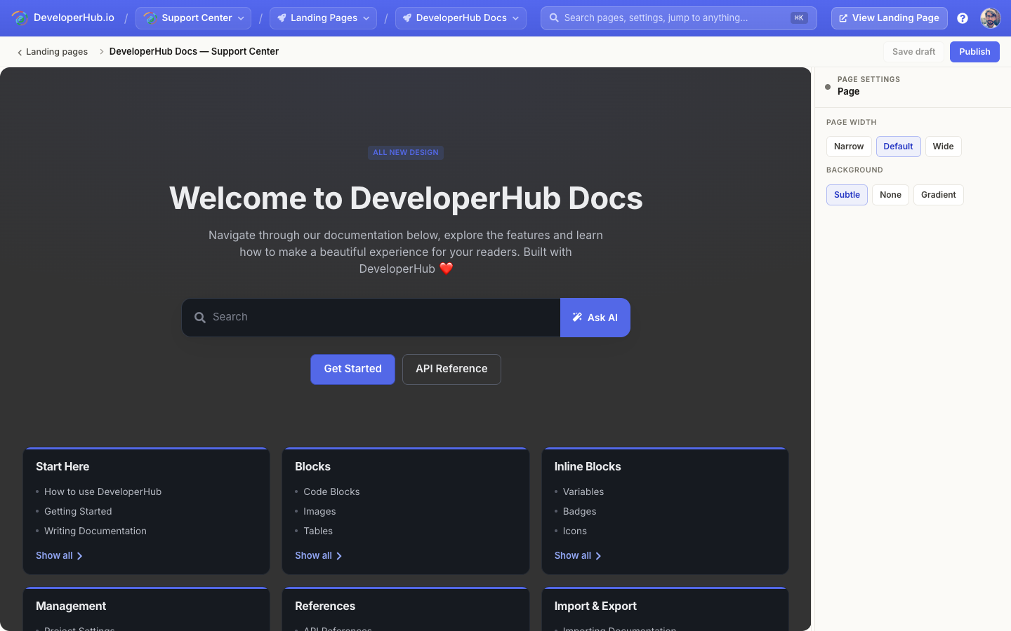
The landing page designer
Working in the designer:
- Select a block: click any block on the page. The inspector swaps to that block's settings.
- Edit text: click into a heading or text block and type. Changes are kept when you click away.
- Reorder: use the drag handle on a block's action column to move it up or down.
- Duplicate or delete: use the duplicate and delete buttons on the same action column.
- Page settings: click an empty area of the page, or press
Esc, to deselect everything and show the page-level settings.
Your theme, brand colour and dark mode are inherited from your visual settings, so a landing page always matches the rest of your docs.
Only project Publishers and Admins can edit landing pages.
Blocks
A landing page is made of blocks stacked top to bottom. To add one, click Add block where you want it and pick from the library.
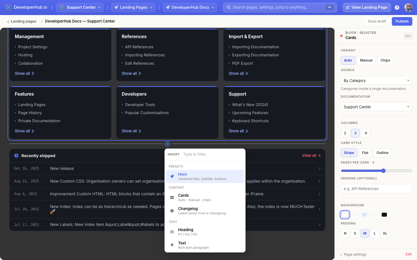
The block library
The available blocks are:
- Hero: a prominent header for the top of the page. Choose a variant (Centered, With media, With code, or With search) and set a title, subtitle, an optional pill label, and buttons.
- Cards: a grid of cards linking into your docs. The cards can be auto-generated from your content or authored by hand. See Card Generation Strategy.
- Changelog: a compact "recently shipped" list pulled from one of your changelogs. It always shows the latest posts, so it stays current without re-editing the page.
- Heading: a section heading (H1, H2, or H3).
- Text: a rich-text paragraph for any prose you need.
- Buttons: one or more call-to-action buttons (primary, outline, or ghost styles).
- Row: a multi-column layout (2, 3, or 4 columns) so you can place other blocks side by side.
- Spacer: vertical breathing room between blocks.
Block Styling
Alongside its own options, every block shares a common set of style controls in the inspector:
- Background: None, Subtle, Brand, Striped, or Dark.
- Padding: from None to XL, controlling the vertical space the block occupies.
- Align: Left, Centre, or Right, for blocks where alignment applies.
Card Generation Strategy
Cards are the most flexible block. A Cards block has a Variant that decides where its cards come from.
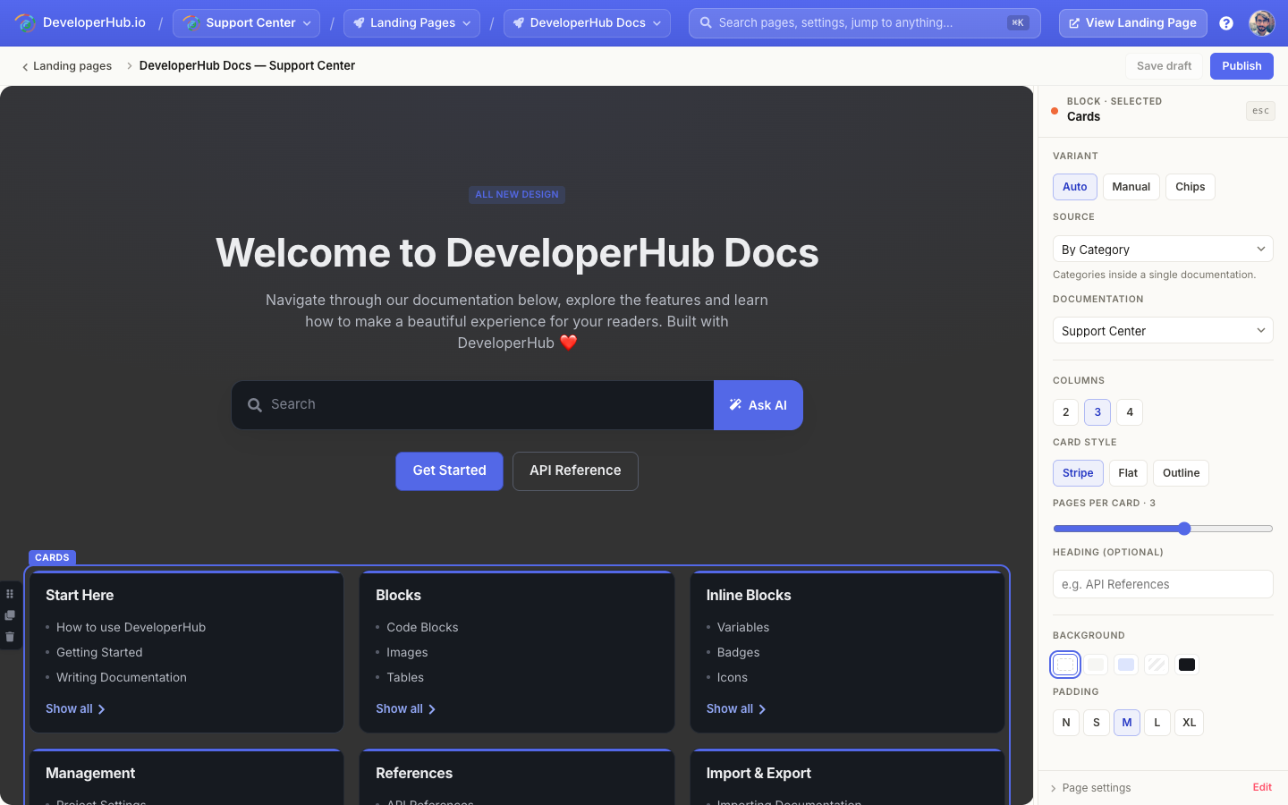
A Cards block and its settings
Auto
Cards are generated automatically from the structure of your project. Pick a Source to control how:
- Smart Auto: DeveloperHub chooses the best layout based on your project's structure. This is the default and a good starting point for most projects.
- By Navigation Group: one card per navigation group.
- By Section: one card for each documentation or API reference in your project.
- By Category: one card per category inside a single documentation. Choose which documentation to draw from.
- Hand-picked: pin the exact sections or pages you want to feature. You can override the title and description of each.
Because auto cards are derived from your content, they update on their own as you add, rename, or reorder docs.
Manual
Author each card yourself. A manual card carries its own title, description, link, optional eyebrow label, icon, and cover image. Use this when you want full control over what each card says and where it points, including links outside your docs.
Chips
A compact row of label chips instead of full cards. Chips can be typed in by hand, or generated from an auto source's card titles.
Card Display
Whatever the variant, you can fine-tune how the cards look:
- Columns: 2, 3, or 4 across.
- Card style: Stripe (a brand-coloured top bar), Flat, or Outline.
- Pages per card: how many child links each card lists (0 to 5).
- Heading: an optional label shown above the grid (for example "API References").
Page Settings
With nothing selected (click an empty area or press Esc), the inspector shows settings for the whole page:
- Page width: Narrow, Default, or Wide.
- Background: Subtle, None, or Gradient.
The page's title and meta description are set on the Manage Landing Pages screen.
Drafts and Publishing
Your changes are saved automatically as a draft, which is not visible to readers. When you are happy with the page:
- Click Publish to make the current design live.
- Use Save draft to keep working without publishing.
- Discard a draft to roll back to the last published version.
To see the page as a reader would, click View (on the Manage Landing Pages screen) or View Landing Page in the top navigation. It opens in a new tab.
Custom Pages
Custom pages are additional landing pages that live at a path of your choosing. They are designed with the same block-based designer as the main landing page.
To create one:
- In the editor top navigation, open the scope picker and choose Landing Pages.
- Open Manage Landing Pages, or use the Landing Pages picker, and click New custom page.
- Enter the path the page should live on, such as
pricing(omit your project's basepath if you have one). - The page opens in the designer, ready to build.
Managing Landing Pages
The Manage Landing Pages screen lists the main landing page and all your custom pages, and is where you change everything other than the design itself.
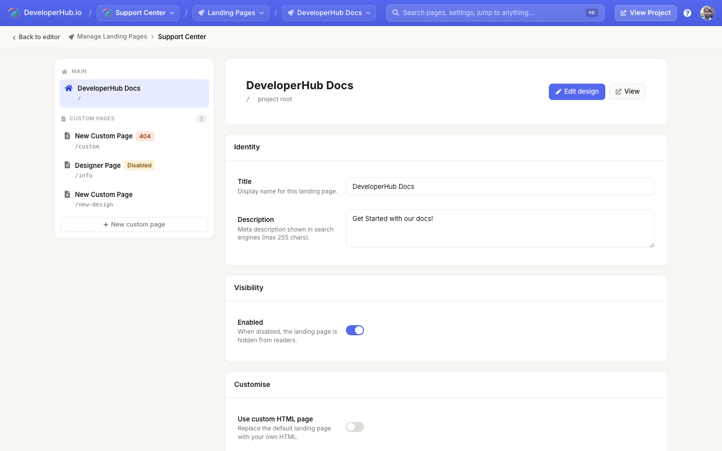
Manage Landing Pages
For each page you can:
- Edit the title and description (the meta description used by search engines).
- Enable or disable it. A disabled page is hidden from readers.
- Open the designer with Edit design, or View the published page.
- For custom pages: change the path, mark it as the 404 page, or delete it.
404 Page
A custom page can be designated as your project's 404 page. When a reader visits a URL that does not exist, they are shown this page instead.
To set one up:
- Open Manage Landing Pages and select the custom page you want to use.
- Under Routing, toggle Use as 404 page.
When a page is used as the 404 page, its own path is ignored.
Only one 404 page can exist in a project.
Custom HTML
If you would rather hand-code a page with your own HTML, CSS, and JavaScript, you can switch any landing page (the main landing page or a custom page) to a custom HTML page instead of the block-based design. See Custom Landing Page.